How to Effectively Design Posters to Promote Your Next Event
- Published: Wednesday, 31 January 2018 12:28
Whether you’re a real estate agent promoting a home open, or a musician promoting a concert, you want to get as many people as possible, to turn up at your event. You can spend hours planning the event down to the last detail, but unless you have a successful marketing plan to get people through the door, it could all be for nothing. This does not happen by itself. It takes forward planning and the right combination of online and printed promotional materials to make it happen.
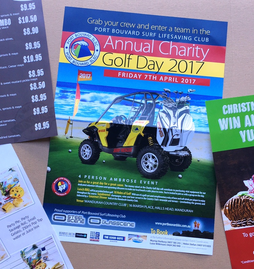
Even with all the noise of the digital world, Promotional Posters are still considered one of the most successful ways to promote an event. There are some important design and content features to consider, when creating a Promotional Poster, and drawing and keeping the audiences’ attention should always be front of mind. Here at G Force Printing, our expert Graphic Designers have put together some handy tips on how you can design an attention grabbing Promotional Poster, to help promote your next event.

Information
Make sure you have the most important information in the heading, and all details are clear and visible. You want the heading to concisely describe what the event is, and encourage the reader to take a closer look. Don’t overwhelm your audience with too much information, this poster should be about creating awareness of the event, and providing the next steps for the audience to find more information.
Colours
Colours do a lot more than just look pretty, they can capture the audiences’ attention, and evoke a psychological response. Depending on the event, you may choose a red or orange, which are ‘loud’ colours that capture the audience attention. Whereas blues evoke more of a serene feeling and greens are associated with health and environment. Getting the colours right will help you attract the audience attention, and evoke the right psychological response to your message.
Images
As the old saying goes, a picture tells a thousand words’. Choosing the right photo or image will immensely help your poster stand out from the crowd, and sell your message. The human brain quickly associates images with information, and the right picture can tell your story quickly and effectively. People’s attentions spans are relatively low, so we want to get the message through as quickly as possible.
Call to Action
Every piece of promotional material you have, should include a call to action. This is telling your audience what steps they should take next. Some simple call to actions might be “Book Now” or “Call Now” or “Visit our Website for further info”. Whatever your Call to Action, its hugely important that is clear and visible, to ensure your audience complies.
Proof Read
It almost goes without saying, but as professional printers, we can’t stress enough, the importance of proof reading. On event posters it is vital you get the right date / time / venue etc – and make sure your call to actions and contact info is 100%.
Tips from Your Printer
Consider the size and quantity you need, before you begin the design process. Understanding which format it will need to be printed on (eg offset or digital printing) will affect the options available, so you want to understand what is possible, before you start designing. You can speak to one of our Graphic Designers, who can help confirm options and create an eye-catching design.
Using printed promotional posters, in conjunction with your other marketing strategies, will ensure your next Perth event is an overwhelming success. For tips on the best promotional materials such as banners, posters, pull up banners, a-frame signs, signage and more, speak to one of our experts at G Force Printing today.